“Kaziukas Mugė” is a city spring fair which is held annually. It’s one of the biggest happenings in Vilnius city during the year, gathering six-digit crowds of craftsmen, traders and visitors from all over the region.
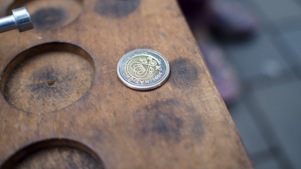
Roots of the fair is dated back to 1604, when prince Casimir gained saint status approval from Vatican.
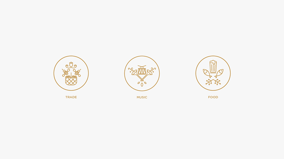
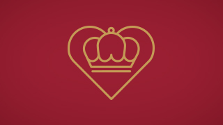
CHALLENGE: the main request of the client (Vilnius City and Vilnius Ethnic Cultural Centre) was to incorporate all the mandatory symbols of the fair. At first it looked like a ridiculous and impossible task, but after more research and sketching, it all lie down together pretty well. The result is a modern coat of arms.
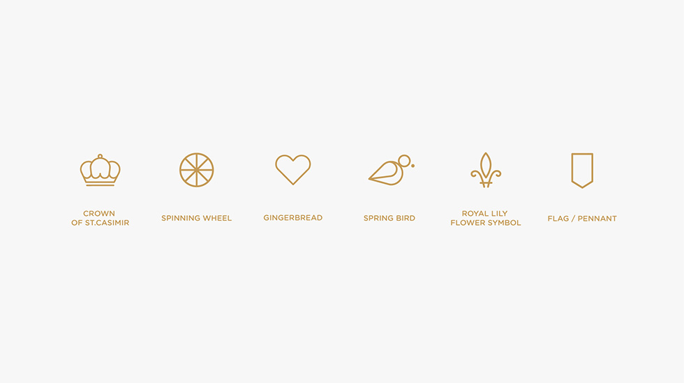
The crown of St.Casimir and lily symbols represent the royal origins of the fair, wheel ornament – crafts and folk arts, heart – local food and well known heart-shaped gingerbread all kids like to eat, little Rook bird (Corvus frugilegus), the very first one to return from south, represents the awakening of the nature in early spring, while giving visual a slight portion of jocosity. Composition is locked in the frame of an ancient flag shape or pendent.